![[insertgeekhere]](http://4.bp.blogspot.com/_FfmQ7SqZV-4/TMygxBrZ3LI/AAAAAAAAABY/91UDYN9JDiY/S1600-R/IGH+Banner.png)
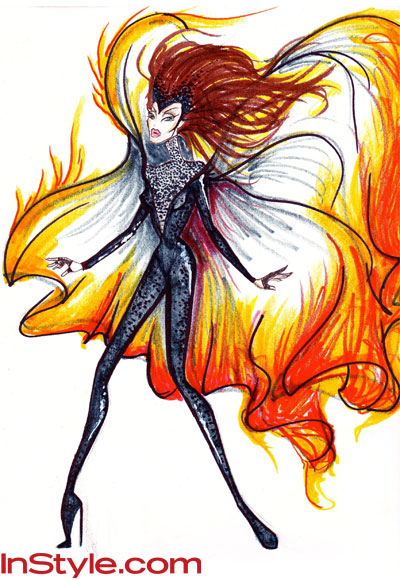
This is my favorite avant-garde design. It's by The Blonds and as you can see, they certainly capture the "on fire" aspect of the outfit. Aside for the book calling for something simpler, my biggest reason for why this isn't the right design for the movie is by making it so extreme now, it would make it very difficult to top this when part 2 comes out and Katniss is outfitted in something far more extravagant that the first fire outfit.

Then there is this design from Tadashi Shoji. I fell in love with this dress. It's gorgeous. I want to wear it. It's just not what the book describes. Not even close. However, I believe this dress should be made. I think it would be popular.
So did any of these designers come close? Any of them capture the feel of the book while creating a piece that could translate well to the screen? There were three designers I think came close - Christian Siriano, Christian Cota, and Charlotte Ronson. The Christians designs were wonderful. They kept it simple, true to the color scheme (black) and made it look good, but ultimately, I think it is this by Ronson that wins my vote.

Katniss does not really wear a dress in the book. She wears a simple black unitard with lace up boots and a cape that's lit on fire. This interpretation is true to the book but is altered just enough that it would look incredible on screen. It would make the splash it's supposed.
What do you think, gentle readers? Do you like these or do you have a different preference? Does this make you more excited for the movie? To see the other designs, check out the article here, and let us know what you think.
I like The Second One More.
ReplyDeleteyes very much.
Deletei like thee third
Deletei vote third
Delete